
How do the returns of the global stock market compare to the normal distribution using the MSCI World as a benchmark?
Unpredictable events, such as the recent Corona Pandemic, have a massive impact on stock market prices. Such crises, but also the everyday chaotic price developments on the stock market, inevitably lead to the question whether the returns of the stock market can be modeled with the simple normal distribution or whether this assumption, which is predominantly made in financial statistics, is incorrect. The Brachiosaurus with its long tail provides a first clue to answer this question.
The Normal Distribution
The normal distribution is a powerful tool used in many disciplines, describing a wide range of phenomena from the distribution of body size in the population to the irregular motion of molecules in liquids and gases. In financial statistics, the normal distribution is also used to describe the potential return and risk of a portfolio. The Black-Scholes model, which provides a theory for valuing financial options and is considered a milestone in financial mathematics, assumes a stock price that follows the normal distribution.
In order to define a normal distribution, you need two parameters: the expected value (aka the return potential) and the standard deviation (aka the risk). Because of its shape, the normal distribution is also called a bell curve. The normal distribution is symmetrical, so that the median and the expected value of the distribution are identical. With the help of the standard deviation, useful insights can be made regarding the probability of a measured value (see Figure 1):
- Approx. 68.3% of all measured values are one standard deviation away from the expected value.
- Approx. 95.5% of all measured values are within two standard deviations of the expected value.
- Approx. 99.7% of all measured values are within three standard deviations of the expected value.
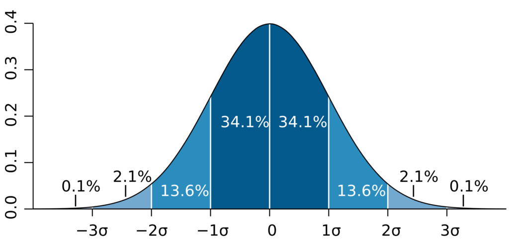
As a consequence of this, measured values that are further than three standard deviations away from the expected value, have a very small probability and are cumulatively responsible for only about 0.3% of the measured points. This finding will play a central role in assessing the adequacy of the normal distribution to describe stock market returns.
Historical Data of the MSCI World
In order to be able to assess the adequacy of the normal distribution for describing the returns of the stock market, we will consider the return distribution of the probably best known index of the index provider MSCI, the MSCI World.
The MSCI World comprises shares of the approximately 1600 largest companies by market capitalization from currently 23 industrialized countries. It forms the basis of the portfolios of many passive investors who invest in the stock market with the help of exchange-traded funds (ETFs). MSCI provides even broader indices such as the MSCI ACWI World IMI, which not only includes industrialized countries but shares of companies from emerging markets, as well as companies with smaller market capitalization, so-called small caps. However, historical data from this index only goes back to 1994, whereas data for the MSCI World has been recorded since 1970 and thus provides a better data basis.
More information about the MSCI World data and where to download it can be found here: https://en.guidingdata.com/financial-data/
The data used include the corresponding price at monthly intervals, starting in January 1970 and ending in February 2021. We use the so-called total returns form of the index, i.e., in addition to price gains, this form also includes dividend payments. We use monthly returns instead of annual returns to increase the number of available measurement points. The returns are nominal returns, i.e., the data are not adjusted for inflation. In total, the dataset includes index values for 613 months. Of these, 383 months have positive returns and 230 months have negative returns.
The first ten measurement points of the MSCI World data can be seen in Table 1. A look at the return column reveals that the 1970 stock market year was not an easy one for investors, with monthly negative returns of up to -9.26% (April 1970).
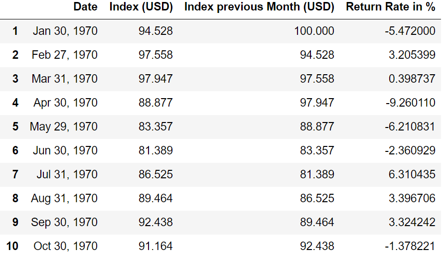
Figure 2 shows the development of the MSCI World over the last 50 years. In addition to the normal linear representation, the index is also shown with a logarithmic scale. The logarithmic representation has the advantage that developments in the range of smaller values can also be visibly represented, even if the data extends over several orders of magnitude (i.e. several powers of 10). Since the base (the index value) keeps increasing, developments closer to the present are exaggerated with a linear scale.
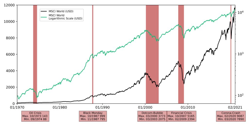
For example, an increase of 10% in November 2020 when the MSCI World was at $11 449 would have resulted in an absolute change of more than $1000, whereas a 10% increase at the beginning in January 1970 would have corresponded to an absolute change of only about $10. On a linear scale, the development in 2020 is shown much more dramatically than that in 1970, although the decisive percentage change is the same. Therefore, in the linear representation it looks as if the prices had practically not moved at all until the 1980s. This misleading effect can be eliminated by using a logarithmic plot. In this case, the distances for identical percentage changes in the chart are the same in each case.
Analysis of the Distribution of Historical Returns of the MSCI World
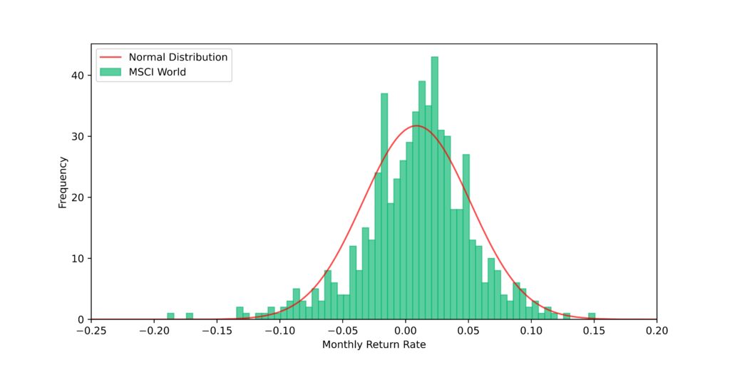
We can now plot the returns we have calculated from the index values in a histogram as in Figure 3. We can also determine the expected value and standard deviations for the MSCI World return. The expected value for the monthly return is 0.87%. Taking into account the compound interest effect, this results in an annualized return of approximately 10.95%. The standard deviation of the monthly return is 4.3% and the annualized standard deviation is 14.9%.
These values for expected value and standard deviation are nominal values and therefore do not take inflation into account. The normal distribution resulting from the data can be seen as a red line in Figure 3. From the figure, we can see that the normal distribution is able to reproduce the basic characteristics of the actual return distribution. However, if we look at the region for strongly negative returns, we see that these returns are underestimated by the normal distribution compared to the actual returns. Apparently, the normal distribution performs poorly in predicting turbulent stock market periods, especially in the strongly negative range of -10% to -20%.
Another tool for examining differences between two distributions is the so-called quantile-quantile (QQ) diagram. This is a graphical tool in which the quantiles of two probability distributions are plotted against each other to check their consistency. In Figure 4, the actual data are shown as blue dots and the theoretical normal distribution is shown as the red diagonal. The more the blue dots deviate from the red line, the more the underlying distribution deviates from the normal distribution.
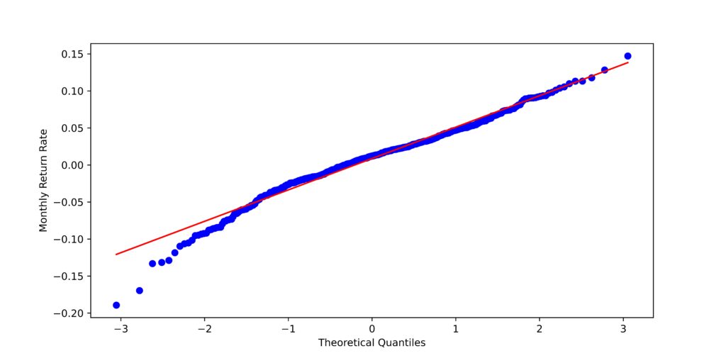
While the positive returns follow the normal distribution very well even for high values, returns smaller than approx. -7.5% are in part strongly underestimated by the normal distribution.
In contrast to the normal distribution, the actual distribution has a so-called “fat tail” for negative returns, similar to the long tail of the Brachiosaurus at the beginning. The actual distribution is asymmetric or skewed with a higher weighting of events with strongly negative returns, whereas months with exceptionally good returns occur less frequently. If we look at all the measurement points in the data that have a monthly return below -10%, we get the following table:
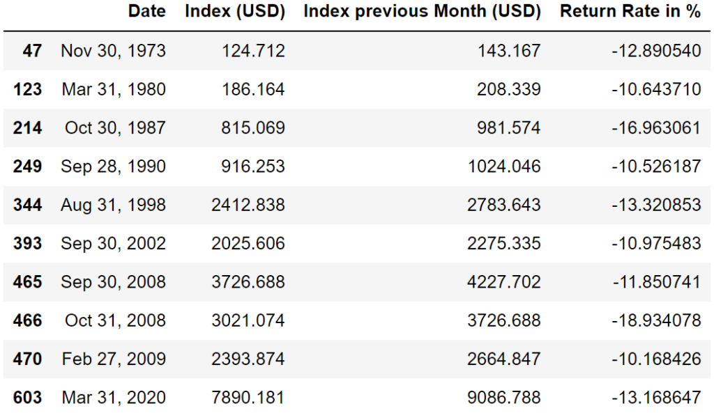
In total, there are ten measurement points that have a worse monthly return than -10%. These measurement points are related to major stock market crashes:
- The oil crisis in 1973
- I could not find any particular event related to the March 1980 decline
- The Black Monday in 1987
- The Japan crisis in 1990
- The Asian crisis in 1998
- In 2002 as a result of the dot-com bubble
- In September and October 2008 when stock markets around the world collapsed in response to the Lehman Brothers bankruptcy and the onset of the financial crisis
- In March 2020 as a result of the Corona Pandemic
Let us take as an example the return from October 2008 of a whopping -18.9%. Already on the basis of the standard deviation of 4.3%, we can deduce that such an event is extremely unlikely with a distance of 18.9/4.3 ≈ 4.4 standard deviations from the expected value. According to the normal distribution, such an event would possess a probability of only 0.0002 and would thus occur only every 4,884 months or 407 years. If we take into account other events from the last century, such as the First and Second World Wars and the Great Depression in the 1930s, which were also followed by drastic economic cuts, this value seems too optimistic.
How can we explain the existence of the “fat tail” for negative returns? A plausible explanation for this phenomenon can be found in the field of behavioral psychology, namely the so-called negativity bias. It states that people tend to be more influenced by negative events and emotions than by positive ones. Since most market players are human, this effect is also reflected in the stock markets. For example, when unexpectedly good economic data is announced, this tends to have a smaller effect than the negative equivalent.
This asymmetry in processing negative events makes sense for evolutionary reasons, because organisms that have adapted better to coping with life-threatening situations have been more likely to reproduce. In addition, missing opportunities with positive outcomes usually has less drastic consequences than ignoring dangers.
During drastic crises, such as last year’s Coronacrash, this effect is particularly evident. An article worth reading that provides an overview of the research on the negativity effect in the context of behavioral psychology is the review article “Bad is stronger than good”. [2]
Conclusion – How does the historical return distribution of the MSCI World compare to the normal distribution?
So what conclusions can we draw from the research on the MSCI World data? The normal distribution is a good approximation for the returns of the global stock market. Positive returns and slightly negative returns are very well reproduced by the normal distribution, while strongly negative returns can be strongly underestimated by the normal distribution. It is important to keep in mind that there are large gaps in the data, especially in the negative range, which do not contain any measurement points at all. This is a clear indication that the historical period for which MSCI World data is available does not extend far enough into the past to make more reliable statements about the distribution of returns.
Nonetheless, the probabilities that follow from the normal distribution for impactful events such as the 2008 financial crisis are probably too low and lead to an underrepresentation of such events. Other MSCI indices, such as the MSCI ACWI IMI, which tracks 99% of the global equity market, provide similar results. However, the period for which these data are available is even shorter and conclusions drawn from them should be taken with even more caution. Only time will tell whether the “fat tail” for negative returns will persist in its current strong form.
An interesting question that now arises is to what extent the underestimation of events with strongly negative returns by the normal distribution affects the predicted return of stock portfolios. To investigate this, we will simulate different portfolios using the Monte Carlo method in the next article. One time we will simulate the performance of a portfolio using the normal distribution, while the other time we will use the actual historical returns of the MSCI World.
In addition, there are so-called skewed distributions in mathematics, which are able to reproduce “fat tails”. How these distributions compare to the actual historical data will also be highlighted in an upcoming blog post.